Alexandria’s City Equity Map
Welcome to Alexandria’s City Equity Map! This tool helps you explore the state of equity in the City of Alexandria, VA. Using a straightforward method to assess disparities in key social and economic areas, this tool aims to help staff and community members make equitable and inclusive decisions. The City Equity Map provides a clear, data-driven way to visualize and understand how equity is distributed across Alexandria's racial and ethnic groups. Explore the City Equity Map. Are you a community member interested in learning more about the tool or want to schedule a training? Please contact equity@alexandriava.gov.
See below for some FAQ's on the Map.
City Equity Map FAQs
The CUNY Method is a way to measure inequality and track progress over time. It was created by the City University of New York (CUNY) through its Institute for State and Local Governance (ISLG), with support from The Rockefeller Foundation and 100 Resilient Cities.
In simple terms, the CUNY Method looks at data about different groups of people, for example, by race or ethnicity, and compares the outcomes of the group doing the “most well” with the group facing the “biggest challenges.” This helps us see where gaps exist and whether those gaps are getting smaller or larger over time.
The method is called the CUNY Method because it was first designed and tested at CUNY.
The CUNY Method has been used in several places across the United States. Cities such as Dallas, Oakland, St. Louis, Tulsa, Pittsburgh, and Houston have applied this approach to better understand inequality in their communities and to guide their equity work.
We chose the CUNY Method because it is one of the easiest and clearest ways to measure equity. The steps are simple, which means the process can be repeated and trusted over time. The scoring system is also easy to understand. Just like in school, the scores go from 1 to 100. A score of 100 means “perfect equity,” where everyone is doing equally well. Lower scores show where there are bigger gaps between groups.
[Read more about the method here: Case Study: Equity Indicators — CUNY Institute for State & Local Governance (ISLG)]
The map is meant to do two things: first, to spark curiosity about the state of equity in our City, and second, to encourage people to explore other tools, resources, and data that are available. Think of the map as one tool in a larger toolbox. It is not the final answer, but it helps City departments, residents, businesses, and nonprofits make decisions that are fair, informed, and backed by evidence.
Yes, the map can be a helpful starting point for these decisions. However, it should never be the only source you use. We recommend working with the Office of Performance Analytics (OPA) or other City departments to gather all the right information before applying for grants or deciding how to allocate resources.
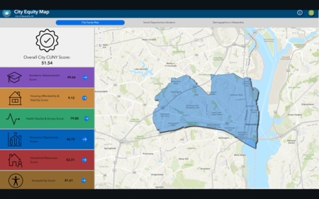
The City Score is created by looking at all the different themes in the map (such as health, housing, education, and jobs). Each theme has its own score, and then those scores are averaged together to make one overall number. This number gives us a snapshot of how the city is doing at that point in time.
The Map and City Score are a snapshot that shows where things stand right now based on the indicators in the map. The scores will change over time, but real, lasting improvement often takes time. The important takeaway is this: the Map makes inequities visible so we can all better understand them and work together on solutions.
The City Equity Map consists of 22 indicators that measure disparities within the City of Alexandria. The indicators are organized across 6 overarching themes Academic Achievement, Housing Affordability and Stability, Health Quality and Access, Economic Opportunity, Household Resources, and Accessibility. Building on data found in the original map and comparing indicators used by other local governments that used similar mapping techniques or ‘report card’ scores, a list of possible indicators was chosen through research and data review. To gather community input, this draft list was shared with community members, nonprofits, and City staff for feedback. Based on that input and the availability of reliable data, the final set of indicators were selected. Each indicator counts the same toward the overall score.
Census data was chosen because it is reliable and consistent. The American Community Survey (ACS) is done every year by the U.S. Census Bureau and gives important information about people’s jobs, education, housing, and more.
Benefits: It’s a trusted national survey that gives timely and accurate data, even for small areas within the city.
Limitations: Because it is a national survey, it may miss some of the details and experiences that could come from surveys done only with Alexandria residents.
A census tract is a small section of the city, kind of like a neighborhood, that the U.S. Census Bureau uses to collect data. Showing the data at this level helps us see differences across the city more clearly.
Usually on maps, lighter colors are used to mean “better”, and darker colors mean “worse.” On this map, we flipped that idea. Darker colors show areas that are moving closer to equity on a certain indicator. Lighter colors show areas that are further away from equity.
Census tracts are not perfect. For instance, on the Northeast tip of the City sits Census Tract 9800, a tract where nobody lives. For other Census tracts, there are some where there are only renters, others where there is only one housing subdivision, etc. The map is one tool to showcase the City of Alexandria, but users of the map are asked to still be critical of the data presented and always use their own knowledge of the City and its residents to build a full picture.